Since Bodoni is a revived version of many original typefaces, its design can be accredited to three individuals: Chauncey H. Griffith, Morris Fuller Benton, and Giambattista Bodoni.
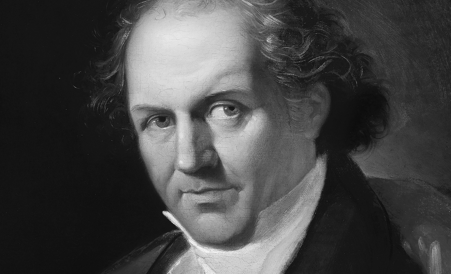
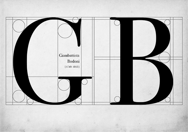
Bodoni's original Roman design dates back to 1798 with Giambattista Bodoni. He was a reputable typographer, designer, and printer based in Italy, but was admired even more for his compositor skills and technical perfection. His tendency to cut letters became a style referred to as "Modern," where the thick and thin parts were heavily distinct. Bodoni, one of these Modern typefaces, was created during a 1700-1800s European art movement. Influences from the works of English designer John Baskerville as well as French designer Francious Didot can be seen within it. Despite having a rather plain aesthetic that lacked ornament, Bodoni rose to fame rather quickly and became the "King of Typographers" in some eyes. He gained international recognition from figures such as Napoleon Bonaparte, fellow printer Benjamin Franklin, and even Pope Pius VII. Not everyone was a big fan of Bodoni, however. Esteemed British designer and writer William Morris claimed the typeface was illegible for its thicks and thins, deeming it useless for body copy. Ever since then, Bodoni would go through many trials of revisions.
The baton was passed on to a man named Morris Fuller Benton (1872-1948), who was best known for being the chief type designer of the American Type Founders (ATF) design department and a prestigious designer of metal type. Alongside a team, he completed around 221 typefaces that consisted of both original and reworked versions of existing typefaces, one being a variant of Bodoni. In the span of 16 years, several versions came together to form a family consisting of fifteen font variations of the original style. Finally came Chauncey H. Griffith (1879-1956), who mainly developed his career in New York as the assistant of Linotype's president and pushed to make Linotype equipment the standard for the printing industry. Linotype was the foundry of Bodoni and its many versions such as Poster Vodoni, which Griffith used to make neon signs. In addition to him and many others such as Monotype, Robert Wiebking, and R. Hunter Middleton, Bodoni was able to become a reliable, well-known design with its multitude of versions and variants.
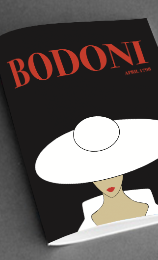
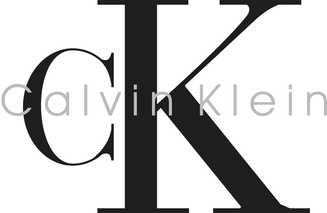
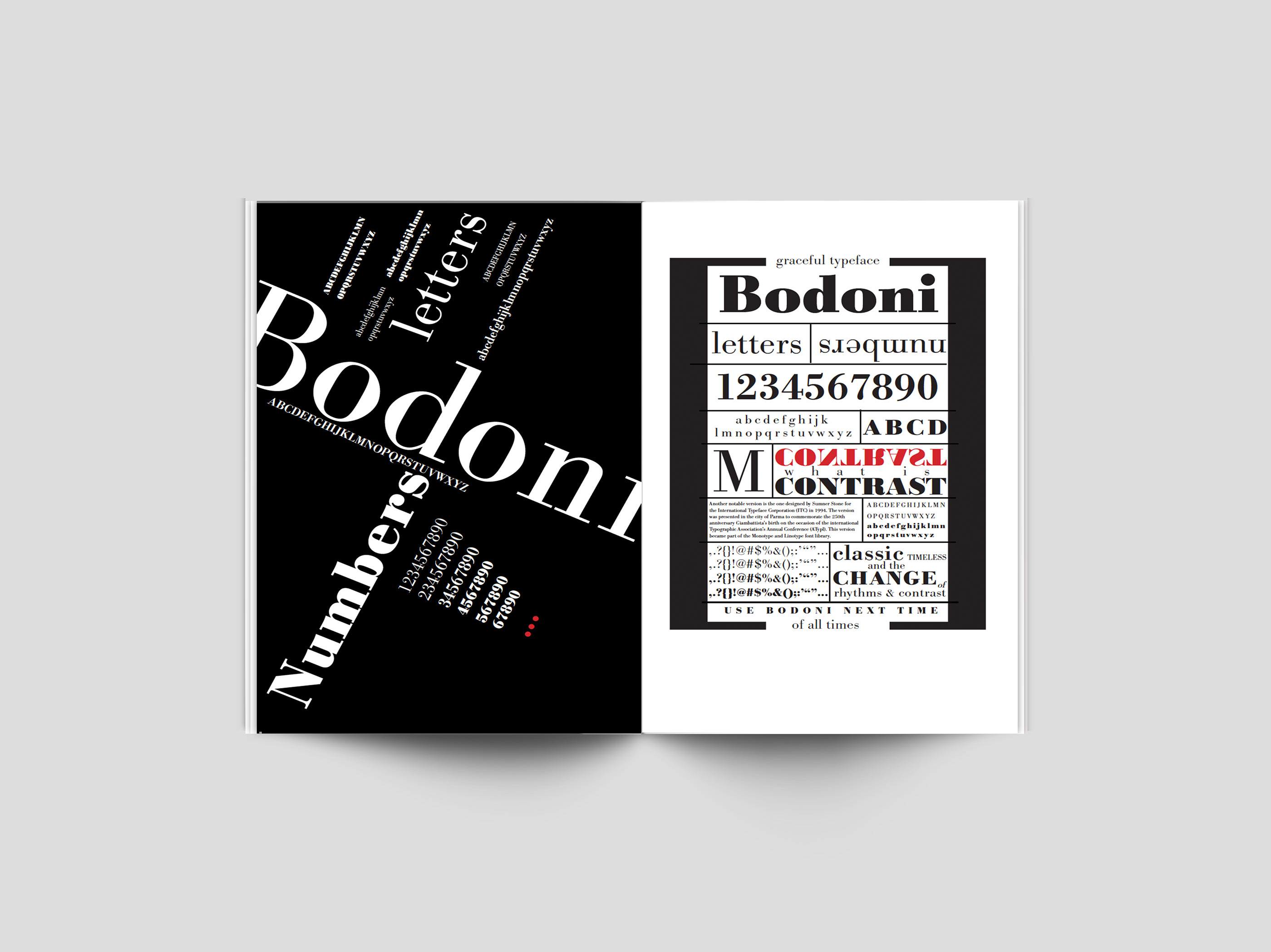
Other versions of Bodoni now showcase Tru-Cut Bodoni, Bodoni Modern, Bodoni Classic, and WTC Our Bodoni. Within itself, there are different fonts to choose from such as bold, italic, light, roman, and title from the Bauer version and even bold shaded. Overall, Bodoni is considered a transitional, serif typeface that is somewhat difficult to read and use effectively due to its contrasting strokes. It is mainly seen as an effective display type for bold statements in logos, advertising, font titles, headlines, and other printing means. For example, it has been used in the infamous Calvin Klein "CK" logo, the Metropolis and Elle magazines, and the poster design for movies like Black Dahlia and Mama Mia. Even though it may not be the most versatile typeface out there, Bodoni has been a widely interpreted design throughout centuries that went through its share of refinement and change to become the display type it is today. When implemented purposefully, its strong verticality, classy serifs, and even weight distribution can successfully provide a design with a sense of elegance and balance.
Sources
Amanda. "Bodoni - Giambattista Bodoni." ODU Graphic Design Theory, 4 Apr. 2011. https://odudesigntheory.wordpress.com/2011/04/04/bodoni-giambattista-bodoni/
"Chauncey H. Griffith." Wikipedia, 5 Oct. 2017. https://en.wikipedia.org/wiki/Chauncey_H._Griffith
"Giambattista Bodoni." Wikipedia, 14 Sept. 2020. https://en.wikipedia.org/wiki/Giambattista_Bodoni
Linotype. "Bodoni." Fonts.com, n.p.d. https://www.fonts.com/font/linotype/bodoni/story