Background
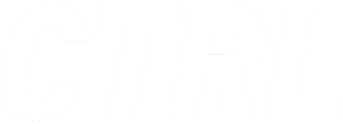
URW DIN is in the family of the URW GmbH Type Foundry, which was founded in 1996. The URW Type Foundry is from German company from Hamburg, Germany. URW DIN is a sans serif font. Within this font, there are 48 different styles ranging from thin to black. It includes 3 different widths and style-specific detailing. The differing widths compensate for varying weights of the font as style changes. Within the 48 styles, the font can be separated into three groups based on width. Normal width, semi condensed width, and condensed widths each have eight upright and 8 italics versions. There is a total of 953 characters per style. Within the styling of the font, ligatures, ordinals, symbols, and figures are modified speficially for the font to make it more cohesive and usable for many purposes. Each of the 48 styles were designed by Volker Schnebel in 2016.
History
Volker Schnebel has been known as the chief type designer of URW++ since 1995. He was born in 1950. Schnebel studied at the HFBK University of Fine Arts in Hamburg and then began working with the old URW in 1977, helping to design IKARUS software for developing digital typefaces. Because of his work with designing IKARUS, he became an expert with the software and helped teach its uses to other companies.2 Schnebel also spent half of a year in the United States to work with Compugraphic, which is a company that works on typesetting systems. Compugraphic and Schnebel worked together to develop 800 Bitmap-Fonts for DEC.3 Over the years, Schnebel worked in various ways to digitize fonts, such as Arial, with his team, the Digital Type Company, which he founded in 1985. He also worked on designing new fonts for CorporateFonts and many others. Over the past two decades, Schnebel has given multiple lectures on type and typography in Germany. Most recently, in 2018, Schnebel worked with Arlette Boutros to create URW DIN Arabic.2
Anatomy
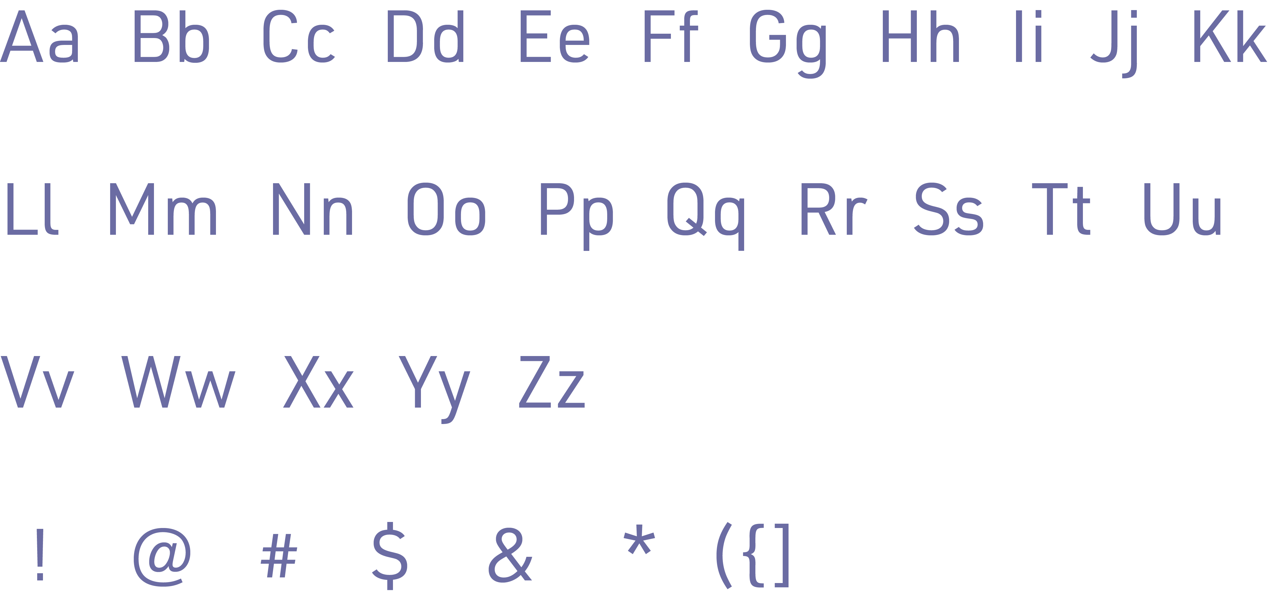
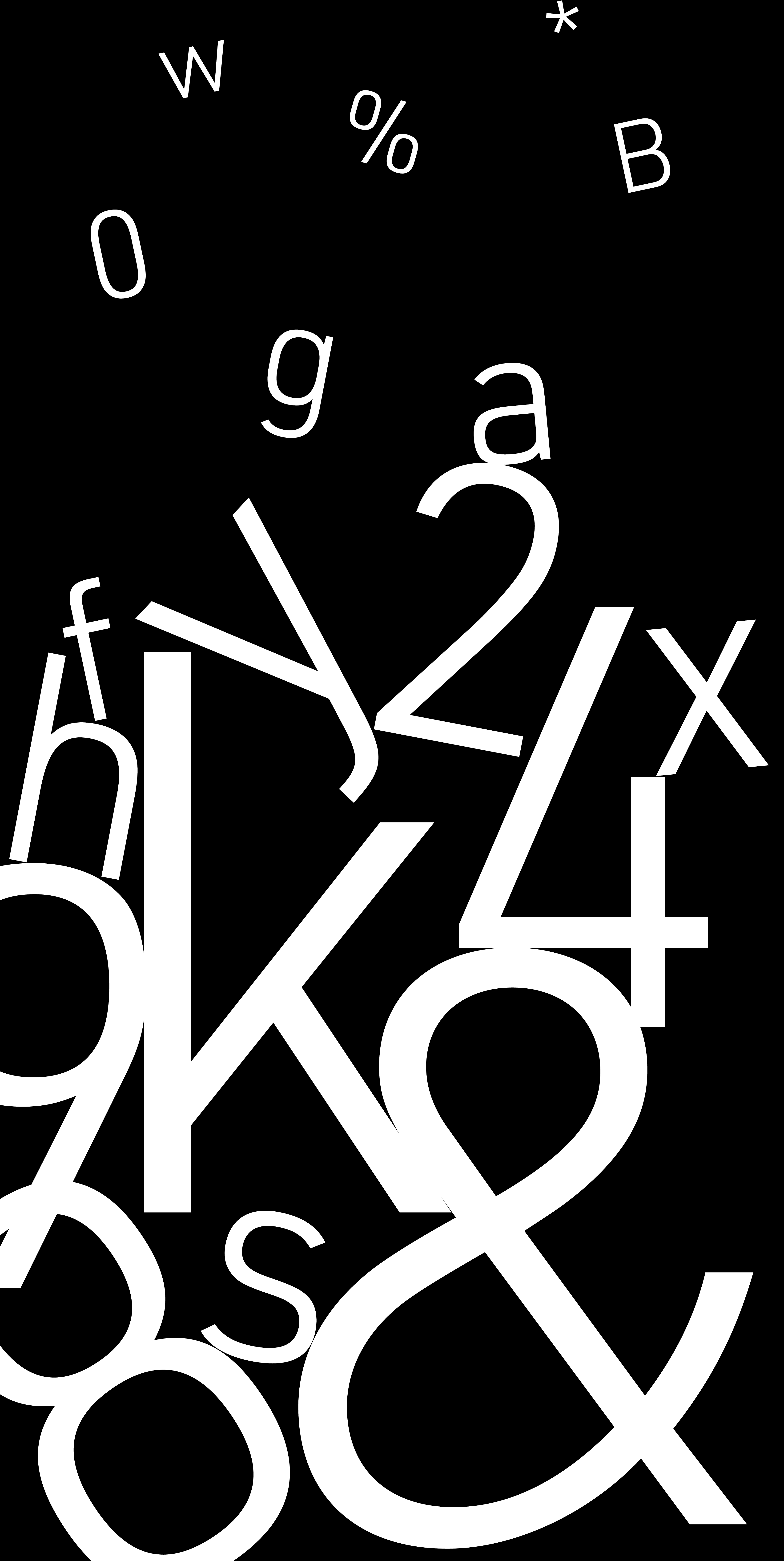
Characters
Uses & Examples
Origins of the DIN font come from DIN 1451 Fette Engschrift and Fette Mittelschrift, which were created by URW in 1984. Aforementioned font families were mainly used for traffic signs, but developed in usability with the 48 different styles and becoming known as URW DIN font family. Today, uses for this font can range broadly and is popular for its long x-height and differing widths based upon style choice.2
URW DIN can be described as having professional qualities, clear shapes, and easy legibility. The font is often used digitally for websites, e-books, and apps on desktop and mobile devices. This font has been used for company logos such as DirectTV, Forever 21, and the Italian University for Designn (IAAD). The font sends a youthful yet professional message to viewers because it is sans serif and has even lines and strokes. It can be used in many different languages, and there is an official version of the font, named URW DIN Arabic. It can be read in every size of font and can be modified to fit a lot of text in a small space because of the different widths and weights. Overall, the typeface is very versatile in usage and capability.
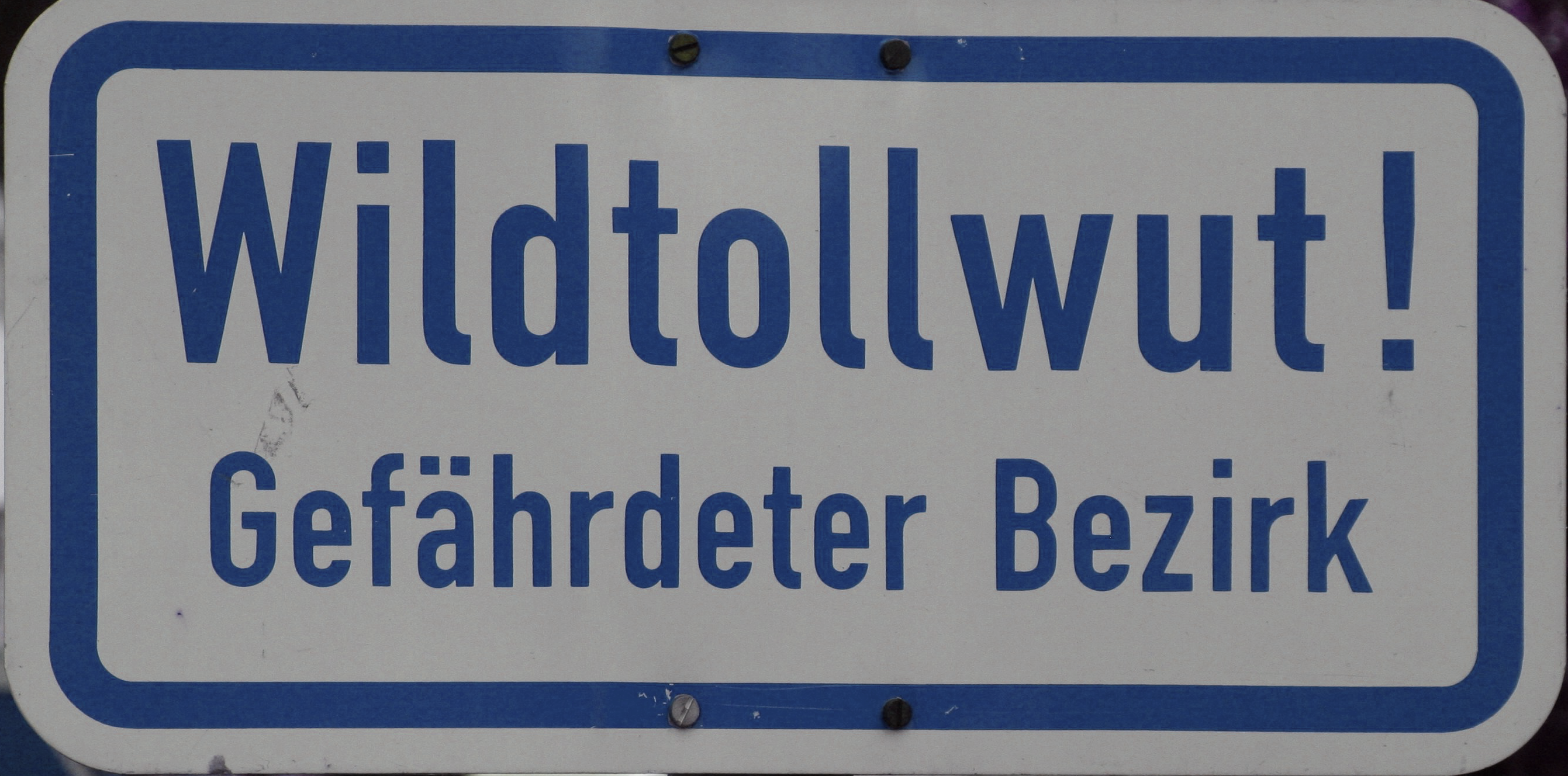
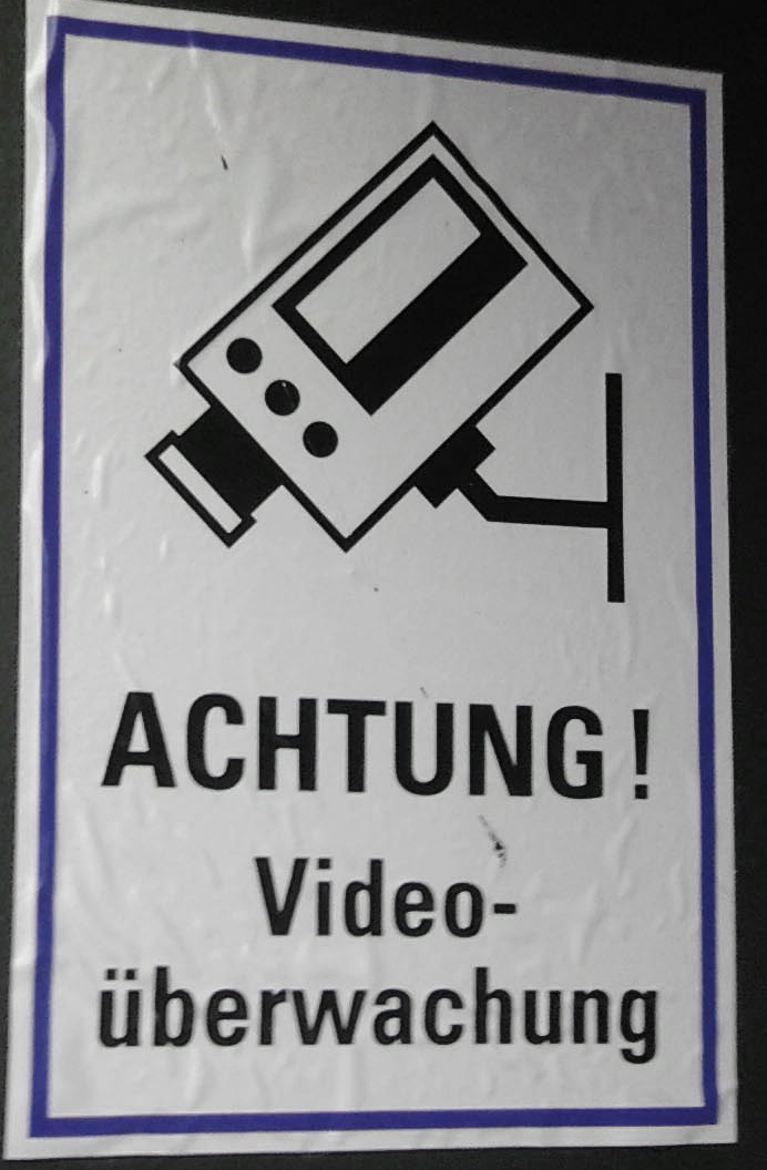
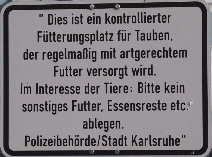
German Signage
Modern Usage