HISTORY
Paul Renner designed Futura with the Bauer Type Foundry in 1927. Renner lived in German academia for much of his youth, eventually finding himself working for the Munich Printing Trade School. This was during a time when sans serif typefaces were less likely to be highly-regarded. The modernist movement, also rampant around this time, suggested a uniformity that Renner was to consider in his pursuit of "the typeface of our time". This is where Futura was created. Futura has several weights, making it versatile beyond its edgy, sans serif form.
Futura PT is a derivative of the Futura family. Vladimir Yefimov and Isabella Chaeva are those listed as designers for the differentiated Futura PT. The Para Type and Neufville Digital foundries are responsible 22 styles for this free branch of theFutura type family. Futura's inspiration was rooted in modernist ideas of the 1920's. Its purpose was a new, distinguishable sans serif font to accurately represent a basic, organized aesthetic. Renner was inspired by capital Roman letterforms, creating an attractive simplicity with his letterforms.
Futura was initially admired for seemingly having obtained longevity. Futura has, of course, remained timeless. This is made apparent by its use in some of large global logos and titles. These include the Nike logo, the Volkswagen logo, the logo for the Pittsburgh Steelers football team, and the Party City logo. It was also been used for other on-screen titles, including credits for American Beauty, a Sesame Street alphabet, and throughout several films. Wes Anderson and Stanley Kubrick are especially
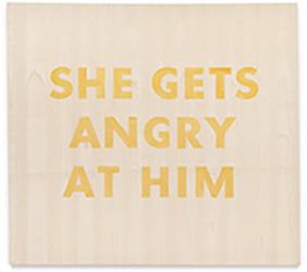
fond of Futura, including it in things such as signs and invitations. This German typeface was a huge contrast to the "fractur" type style which is closely tied to Nazi Germany. It was also engraved in the Apollo 11 plaque — Futura is on the moon. Futura has been used for its readability and simplicity in road signs, on buildings, and in advertising and editorial design. Among these is Barbara Kruger's famous artwork as well, a recognizable feminist series, later adopted into the Supreme logo. It seems to have worked well for corporate needs, and in magazine spreads as well.