Back to ATypeSupreme.com

G

garamond

History

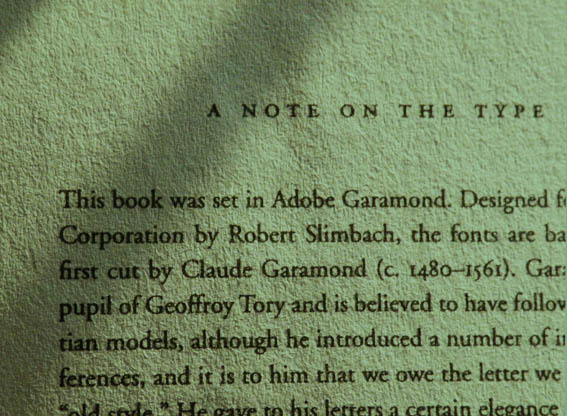
The origins of Adobe Garamond go back much further than its inception in the late 20th century. There is a huge legacy behind the name Garamond, and all of it is descendant from one French type designer and engraver named Claude Garamond. Garamond, alive between 1499 and 1561, was best known for the roman style typefaces he designed. He was an apprentice to Antoine Augerau and later worked for Geoffroy Tory, a very well acclaimed engraver at the time (Claude Garamond). In his time working as an engraver and type designer Garamond developed his own well distinguishable style which is best characterized by soft rounded serifs that often have a concave slanted dip to them.

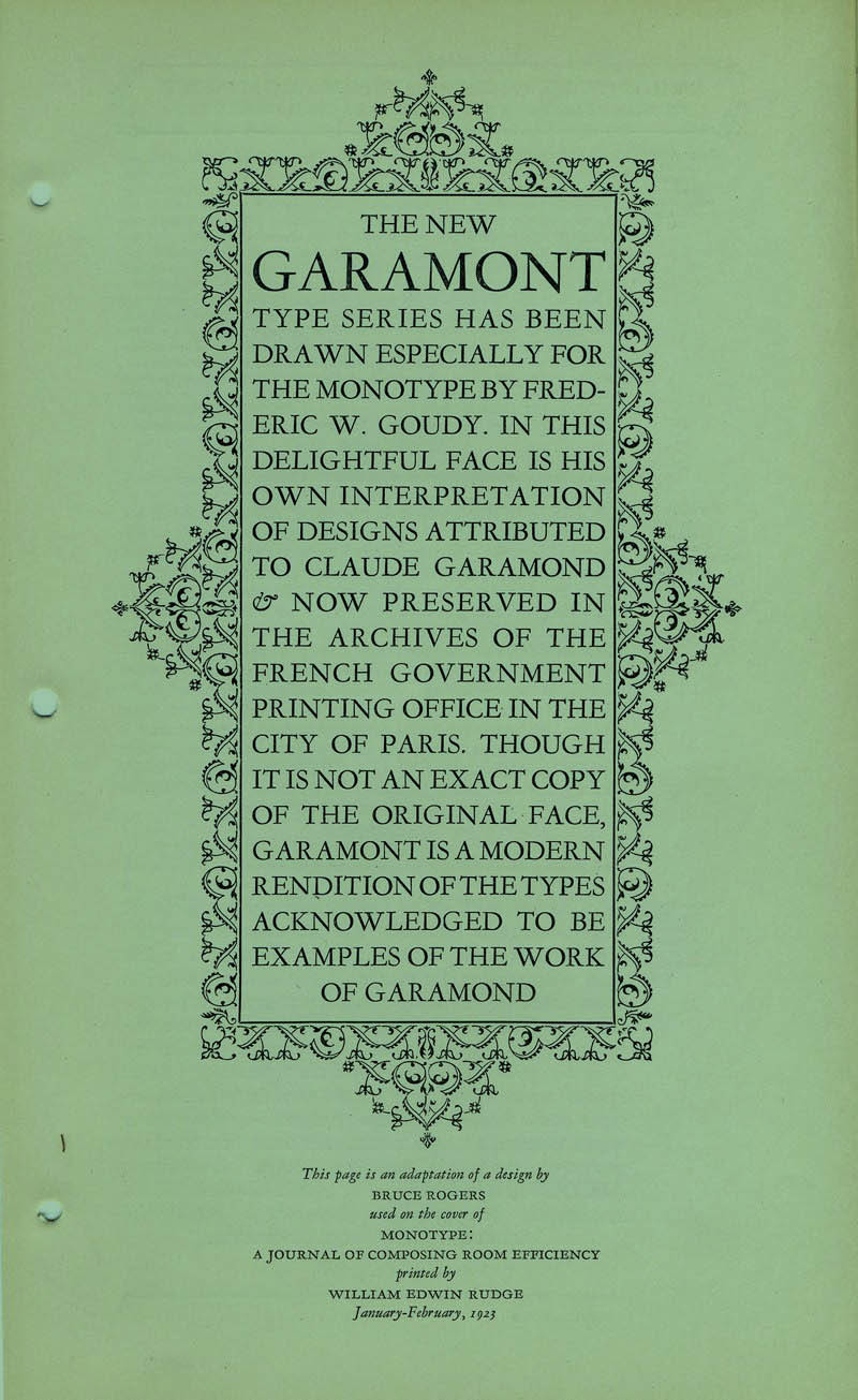
There is no “original Garamond” typeface. The name is simply from the general characteristics and style of Claude Garamond, which modern type designers continue to go back to. In 1530 however Robert Estienne created a typeface resembling many of the Garamond inspired ones seen today (Chapter 11: Garamond: The Font Series Guide). Since that time the Garamond style has seen several revivals in popularity. In the early 20th century a French type foundry, Imprimerie nationale, began using an old-style Garamond typeface designed by Jean Jannon (Velarde). Today there are many more variations of Garamond to choose from, including Adobe Garamond.

A

A

Lowercase g Letterform Showcase

Garamond’s typefaces have made a permanent imprint on the field of type design, so much so that his name has almost become a genre of type. This applies to Adobe Garamond, which was designed by Robert Slimbach. He was not only influenced by Garamond but also an italic typeface by Robert Granjon, Garamond’s assistant, when creating this typeface (Velarde). Slimbach is an american type designer currently working at Adobe Systems. Other than Adobe Garamond he has also helped create the Utopia, Minion, and Poetica typefaces (Font Designer – Robert Slimbach).

Anatomy

Glyphs

Like other Garamond typefaces, Adobe Garamond is an old-style serif typeface. This typeface includes 6 different font options including regular, italic, semibold, semibold italic, bold, and bold italic. Compared to several other Garamond inspired typefaces Adobe Garamond has less contrast between the width of the crossbars and stems with thicker line weights overall. The rounded serifs in this typeface give it a strong baseline which makes it easily legible even at a small scale. The grounded nature of Adobe Garamond mixed with its timeless elegance makes it a reliable workhorse typeface.

Aa Bb Cc Dd Ee Ff Gg Hh
Ii Jj Kk Ll Mm Nn Oo Pp
Qq Rr Ss Tt Uu Vv Ww Xx
Yy Zz 1 2 3 4 5 6 7 8 9 0 ` ~
!@#$%^&*()_+-={}|[]\:”;’<>?,./

Uses

Garamond typefaces are known for being very legible easy to read typefaces, and Adobe Garamond is no exception. This typeface works well as the body copy for a book, magazine, or in this example, a web page. It is also commonly used for big headlines in newspapers as it is easily readable at many different sizes. Adobe Garamond has an elegant old-style look which can be used in logo design as well for an impactful professional looking logo. (Chapter 11: Garamond: The Font Series Guide) Overall, Adobe Garamond is a versatile and timeless typeface which will heighten the look of any print or web projects.

References

“Chapter 11: Garamond: The Font Series Guide.” Design Roast, March 23, 2020. https://designroast.org/online-guides/font-series/garamond/.

“Claude Garamond.” Encyclopædia Britannica. Encyclopædia Britannica, inc., January 1, 2020. https://www.britannica.com/biography/Claude-Garamond.

“Font Designer – Robert Slimbach.” Robert Slimbach - Font Designer of Myriad, Adobe Garamond, Utopia, Minion ... Linotype. Accessed August 30, 2020. https://www.linotype.com/578/robert-slimbach.html.

Velarde, Orana. “History of the Garamond Typeface.” Freepik Blog, October 6, 2017. https://www.freepik.com/blog/history-garamond-typeface/.