Background
Gill Sans Nova is one of three font families all resulting from the influence of famous British artist and designer Eric Gill (1882-1940). Gill designed Gill Sans in 1926 and was the first san-serif font to be widely distributed to the public. Gill is considered one of the most influential artists of the Arts and Crafts movement in Europe and is best known for his contributions in sculpture and typeface design. As a result, the font Gill Sans Nova, designed by George Ryan (1950), reflects Gill’s stylistic approach to art. Ryan began designing fonts when he was in his late twenties at Mergenthaler Linotype. After a few years of this, he moved from New York to Boston to work for the type foundry Bitstream Inc. He quickly established a name for himself, eventually becoming a manager and then director. He soon created a new type foundry along with a few colleuges from Bitstream Inc called Galapagos Design Group. Ryan joined Monotype Imagining in 2003, leading to the development of Gill Sans Nova. He continues to work there today as a senior designer (linotype.com, 2020).
Gill Sans Nova is san-serif, humanist typeface. Its visual qualities lend itself well to digital applications. The display variations offer deco, inline, outline, and shadow interpretations of the original set of characters. It has a very tall x height, making it extremely readable even when used in small point size.
Gill Sans Nova consists of forty-three different styles and 1098 characters. The font includes characters that make it usable in Latin, Greek and Cyrillic languages. The styles include a wide range of uses, including condensed and display variations. It was a great assortment of weights as well, ranging from ultra-light to ultra-bold. Despite its roots in metal type and printmaking, the font is designed for use in digital media (www.monotype.com, 2020) while taking inspiration from Gill’s original design. Its high readability makes it suitable it a wide range of uses including headlines and body copy. Its versatility is one of the many reasons it is widely used today.
Designers
Eric Sans
George Ryan, Monotype
Classification
San-serif
Humanist
Glyphs
!
@
#
$
%
^
&
*
(
)
_
+
1
2
3
4
5
6
7
8
9
0
-
=
Ww
Ee
Rr
Tt
Yy
Uu
Ii
Oo
Pp
{ }
[ ]
Aa
Ss
Dd
Ff
Gg
Hh
Jj
Kk
Ll
Zz
Xx
Cc
Vv
Bb
Nn
Mm
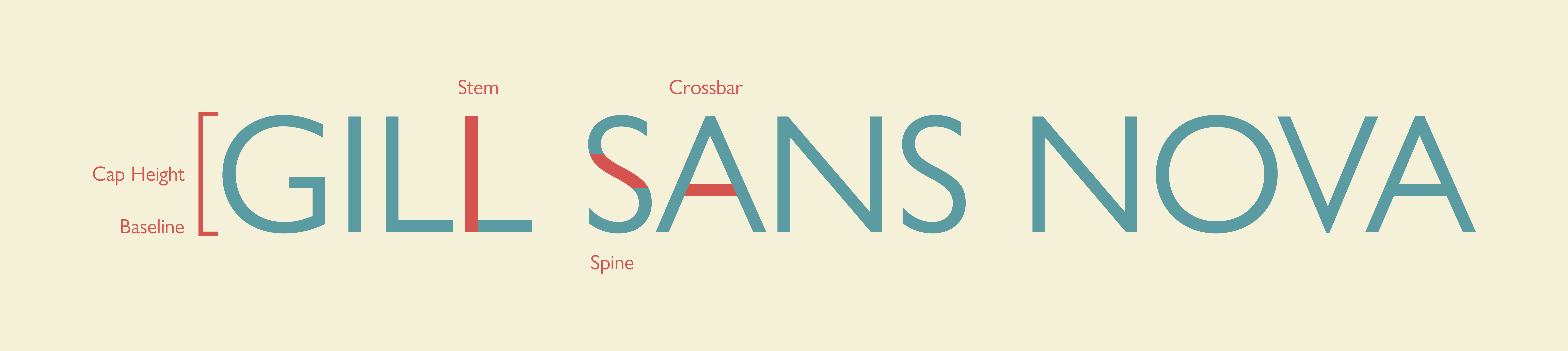
Anatomy


Uses
The Gill Sans family is known for its versatility. Most of the styles are able to be used in projects both large and small without losing readability. As a result, the Gill Sans family is used in a variety of situations including both print and virtual. It is used in books as a very legible san-serif typeface. It is common particularly in England, its country of origin, in wayfinding and signage. On the web, it is used as a body copy typeface. Its ability to work in both virtual and print situations make it a fantastic choice for identity design.