The Neue Haas Grotesk typeface was designed by Eduard Hoffmann and Max Miedinger. At the time of its creation, Hoffmann was the president of the Haas Type Foundry in Switzerland. He hired Max Miedinger, a former employee of the Haas Type Foundry who had become a freelance designer. Miedinger was a gifted salesman as well as a designer, and together they began the creation of a new typeface: Neue Haas Grotesk.
Typeface
In the mid 1950’s the Haas Type Foundry started to notice a decrease in their typeface sales. Hoffmann decided that he needed to create a new typeface that would be more successful than the previous typefaces. He reached out and hired the former Haas designer and salesman Max Miedinger. Then the two started work on a new typeface in 1956. For the next few months the two were busy comparing their drawings and proofs to old grotesk typefaces.
These include typefaces like Akzidenz-Grotesk, Französische Grotesk, and Normal-Grotesk, all of which had all been popular among Swiss designers. The typeface that was created had horizontal stroke terminals, a large x-height, and very tight spacing. These features together resulted in the typeface being dense and having a sturdy texture. Upon Neue Haas Grotesk’s release, in 1957, it also became widely popular. The Neue Haas Grotesk typeface was first shown at Graphic 57, an exhibition of the graphic design industry that took place at the Palais de Beaulieu, in Lausanne, Switzerland. At the start it was only available to hand set type, but in 1959 it was made available to use for the popular Linotype machine.
The name Neue Haas Grotesk was not suited for the marketplace and so the name was changed to Helvetica. The name change made sense as the Neue Haas Grotesk typeface had been significantly changed when converted to machine type. Helvetica has become one of the most popular and well known typefaces that many use today.
However, the original Neue Haas Grotesk typeface was lost to the digital world until just recently in 2010 when Christian Schwartz digitized the typeface. This project was something which he referred to as a restoration. His recreation of the typeface was redrawn to match Miedinger’s original design. Today both the well loved Helvetica typeface and the Neue Haas Grotesk typeface are available for designers to use. This recreation helped to bring back a lost typeface that may offer new options in the field of design. Helvetica is generally considered the king of type, but it can be argued that now that the original version has been recreated there may be a competitor to the popular typeface.
Uses
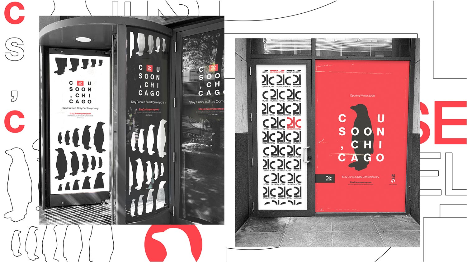
Neue Haas Grotesk is a versatile typeface that can work well for headlines and body text. The typeface was created as a visual neutral. This has led to it being used by many businesses and corporations. Although the more common version is Helvetica, its roots are in Neue Haas Grotesk.
For the best viewing experience, please view this site on browser 768px wide, or larger.