Use Cases


In light of Haas Type Foundry’s drop in sales of their sans serif
typefaces, president Edouard Hoffman employed the talents of Max Miedinger, a typesetter who had previously worked in advertising. Miedinger’s hiring was preceded by an apprenticeship, studies at Zurich University of the Arts, and a typography career in the advertising department of the department store chain Globus. Hoffman proposed the creation of a typeface that would both introduce a competitor to other grotesque fonts and bolster the reputation of the company. Their work in 1956 resulted in one of the most widely recognizable typefaces of all time, Neue Haas Grotesk. Later renamed Helvetica — Latin for “Swiss” — it became emblematic of the International Style design movement. Neue Haas Grotesk was a reworking of typefaces like Berthold’s Akzidenz-Grotesk, which dates back to the 1890s. Akzidenz and other "grostesques" like it were adopted by many Swiss designers in the early 1950s as the International Style grew to prominence.Neue Haas's style of letterform consists of fairly even, broad strokes that are complemented by subtle curves. It quickly became the typeface of choice for International Style designers who sought to imbue their work with clarity, neutrality, and simplicity. Later on, its versatility also became a selling point; many styles were added after its debut.
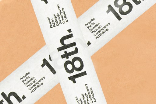
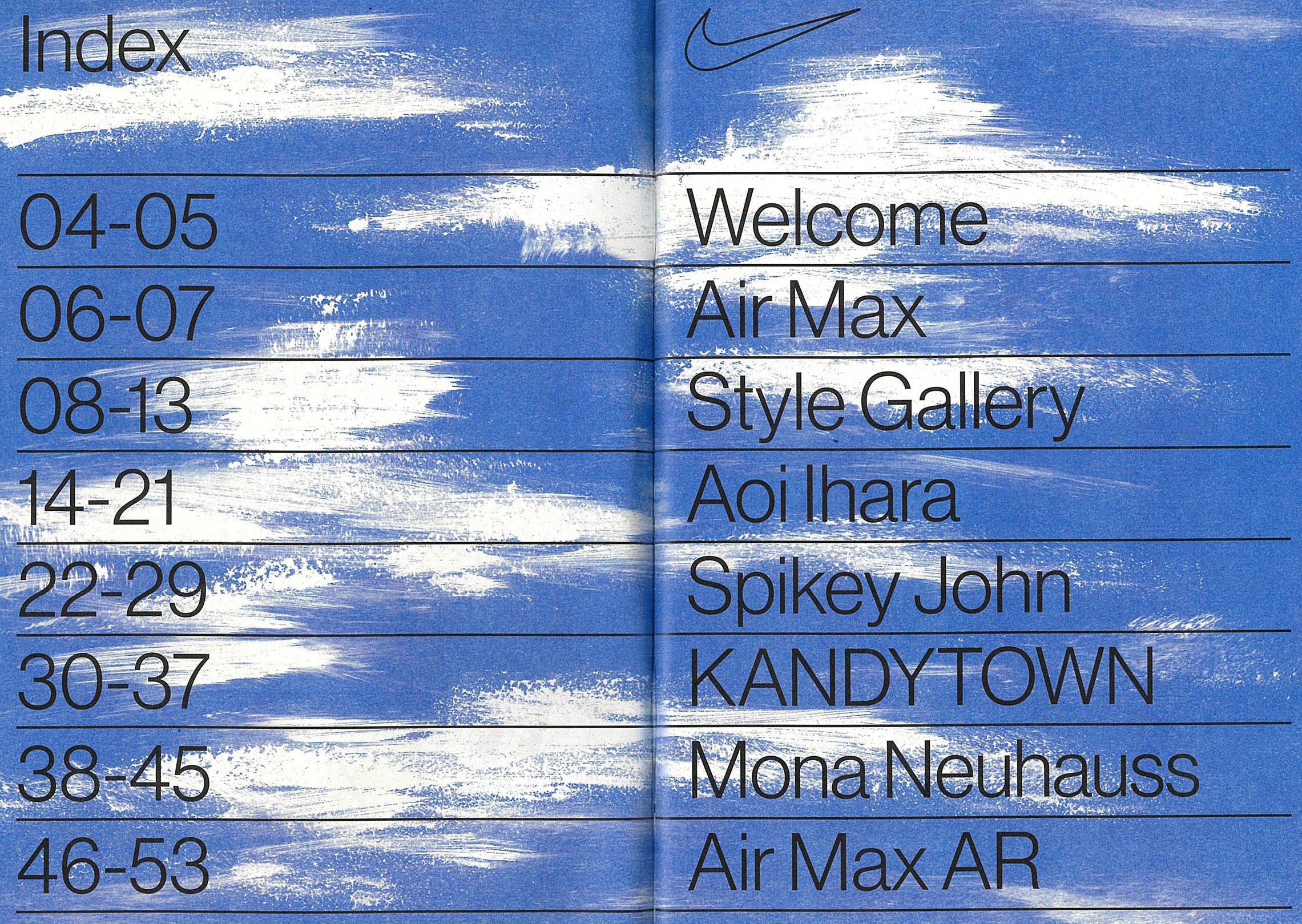
However, after years of slight modifications, rebranding and relicensing, the typeface changed. There are distinctions to be made between Miedinger’s original concept and the slightly boxier version of Helvetica that we’ve come to know. Christian Swartz, who led the effort in digitizing Neue Haas Grotesk, noted that “there is a subtle warmth in the shapes that was lost over the years.” Finally, the classic typeface has been faithfully converted to a digital format. It is difficult to understate the impact that the typeface has had on our collective visual language. Though we aren't always aware of it, we observe the influence of Neue Haas Grotesk when we see logos representing Sears, Jeep, BMW, JCPenney, General Motors, Motorola, Oral B, Nestle, and many other companies.


