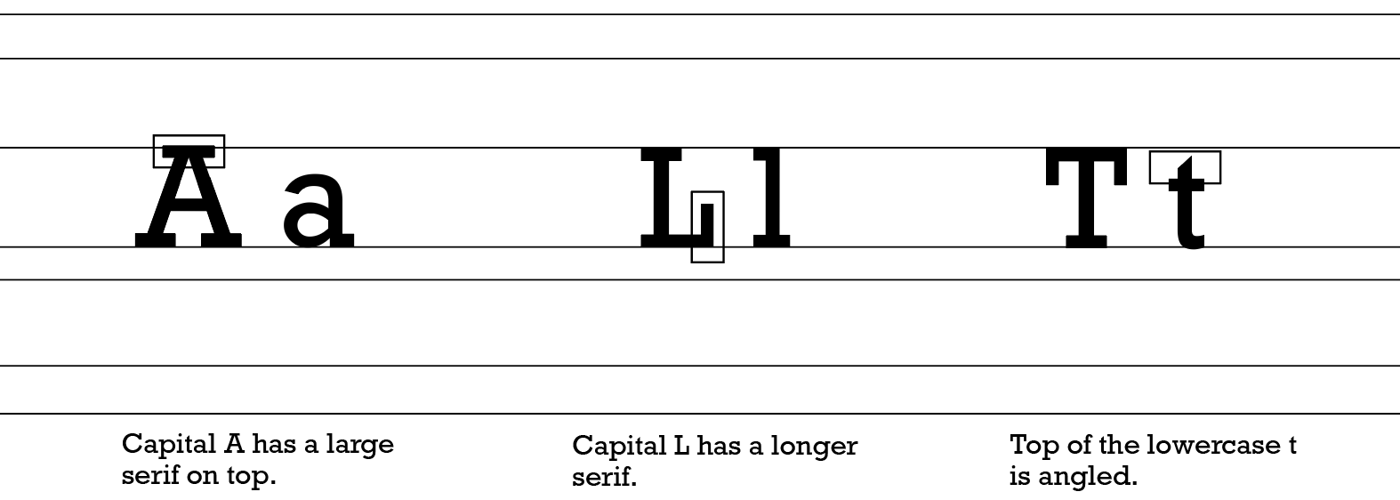
Rockwell Nova
Back to ATypeSupreme.com

RO

CK

WE

LL

Rockwell Regular
Rockwell Bold
Rockwell Italic
Rockwell Italic Bold

A

Glyphs

Aa Bb Cc Dd Ee Ff Gg Hh
Ii Jj Kk Ll Mm Nn Oo Pp Qq

Rr Ss Tt Uu Vv Ww Xx Yy Zz

1 2 3 4 5 6 7 8 9 0

! @ # $ % ^ & * ( ) - _ =

+ [ ] { } ; : ' " < > , . / ?


Rockwell Regular

Aa Bb Cc Dd Ee Ff Gg Hh

Ii Jj Kk Ll Mm Nn Oo Pp Qq

Rr Ss Tt Uu Vv Ww Xx Yy Zz

1 2 3 4 5 6 7 8 9 0

! @ # $ % ^ & * ( ) - _ =

+ [ ] { } ; : ' " < > , . / ?


Rockwell Bold

B

Aa Bb Cc Dd Ee Ff Gg Hh

Ii Jj Kk Ll Mm Nn Oo Pp Qq

Rr Ss Tt Uu Vv Ww Xx Yy Zz

1 2 3 4 5 6 7 8 9 0

! @ # $ % ^ & * ( ) - _ =

+ [ ] { } ; : ' " < > , . / ?


Rockwell Italic

Aa Bb Cc Dd Ee Ff Gg Hh

Ii Jj Kk Ll Mm Nn Oo Pp Qq

Rr Ss Tt Uu Vv Ww Xx Yy Zz

1 2 3 4 5 6 7 8 9 0

! @ # $ % ^ & * ( ) - _ =

+ [ ] { } ; : ' " < > , . / ?


Rockwell Bold Italic

Anatomy

This sturdy typeface has its roots based in geometry. The type is comprised of simple shapes such as circles and straight, angular lines. Despite a rather mechanical formula, the typeface does not feel cold or harsh. The wider lettering and curves from circular shapes allow for a warm and friendly impression to this typeface. The type is a slab-serif typeface that showcases blunt and consistent serifs. Speaking of consistency, the typeface is a monotype which indicates the same line thickness throughout. A notable characteristic of this typeface is the unique slab serif on the top the A.

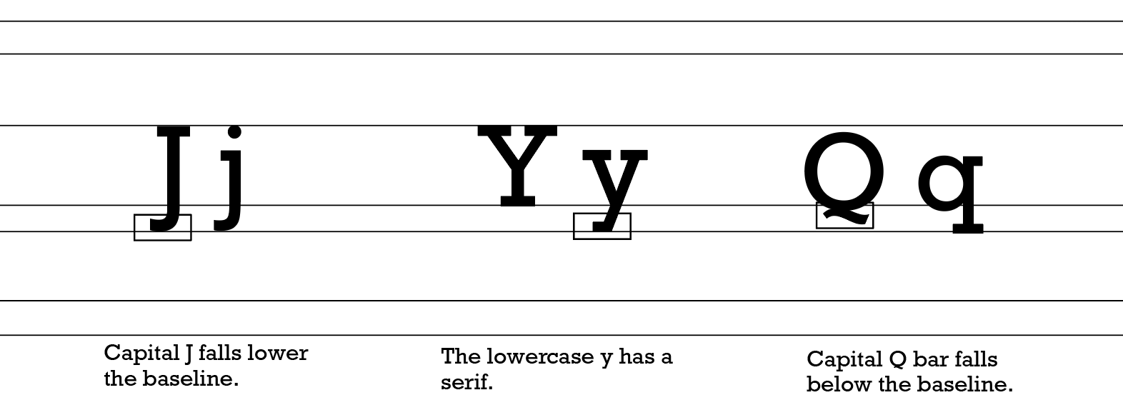
Other interesting features include the slant on top of the lowercase t and the curved tail of the Q rather than one that is straight across. Within the Rockwell Nova type family there is a wide selection of fonts. These fonts include Rockwell Nova Regular, Rockwell Nova Light, Rockwell Nova Light Italic, Rockwell Nova Italic, Rockwell Nova Bold, Rockwell Nova Bold Italic, Rockwell Nova Extra, Bold Rockwell Nova Extra Bold Italic, Rockwell Nova Condensed, Rockwell Nova Condensed Light, Rockwell Nova Condensed Light Italic, Rockwell Nova Condensed Italic, Rockwell Nova Condensed Bold, and Rockwell Nova Condensed Bold Italic.

R

text comp4
text comp4

InUse

text comp1
text comp2
text comp3

L

Background

text comp4

The typeface Rockwell Nova was constructed under the management of American engineer and typeface designer, Frank Hinman Pierpont. Pierpont designed this typeface in 1934 at the Monotype Corporation in Great Britain after managing the establishment of several other faces. The inspiration for this typeface was based off of an older typeface called Litho Antique which was made by the Inland Type Foundry around 1910. Litho Antique contained a more condensed slab serif design and could appear solid and heavy. For this reason, Rockwell Nova was born. Rockwell stays true to its roots but appears lighter than the typeface it was inspired by. The typeface was also greatly influenced by advertiser's need for a type that would stand out.

With new improvements made in the printing technology industry, interesting fonts in advertisement was not only possible but greatly sought after. Improved printing technology was not the only influence in the creation of this typeface. In 1929 the font, Memphis, was released by Dr. Rudolph Wolf at the Stempel Type Foundry. Like Rockwell, Memphis is a slab-serif typeface that pays homage to strong geometry. Memphis influenced the Monotype Corporation to design a slab-serif typeface that would also compete for the attention of advertisers. This typeface has been successful in both print and digital work. Rockwell Nova also has a history of uses. The Guinness World Records used Rockwell in in their early print editions in the 1990s. Tall Lighthouse, an independent poetry publishing company, uses the typeface in its printed books and digitally on their website. The strong and adaptable appearance of this typeface promotes an attitude of honesty and a feeling of straightforwardness. Rockwell would be used well as a display in things such as logos, branding, or headlines. At a smaller size font, Rockwell Nova would be effective in shorter blocks of text. With a long history, Rockwell can also allude to a sense of nostalgia or antiquity. However, in spite of its age, the typeface has contemporary uses as well in web culture.

N

References

"Rockwell Font Family Typeface Story." Fonts.com. Accessed October 22, 2020. https://www.fonts.com/font/monotype/rockwell/story.
Academicbookfuture. "Rockwell Typeface." The Academic Book of the Future, February 27, 2015. Accessed October 22, 2020. https://academicbookfuture.org/2015/02/19/rockwell-typeface/.