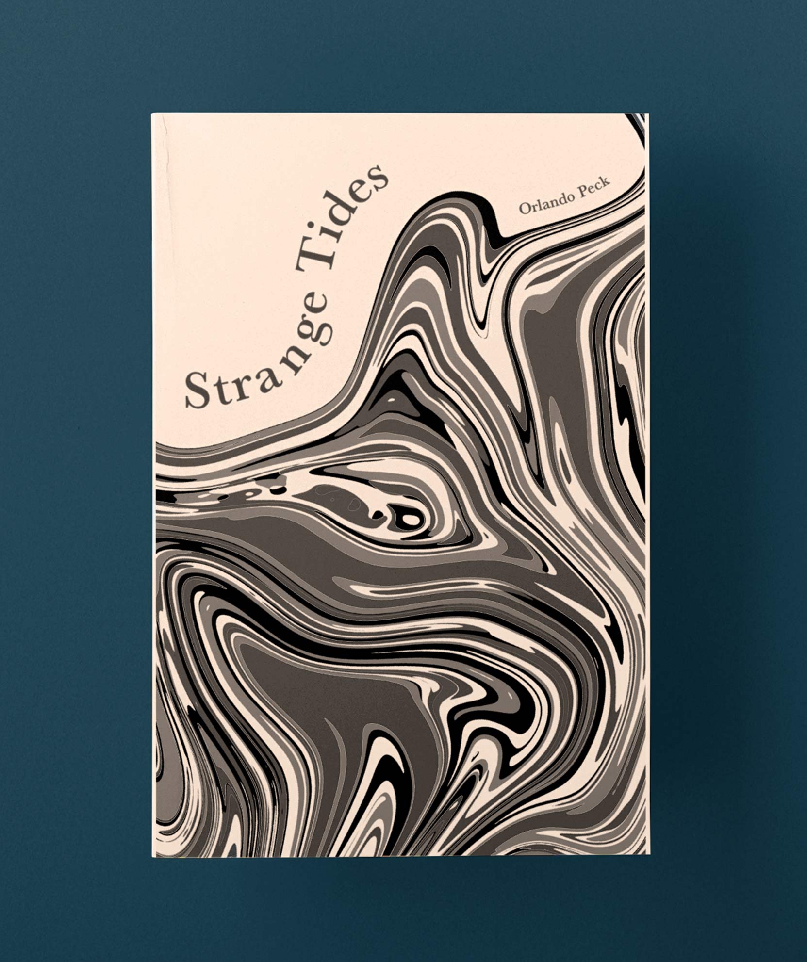
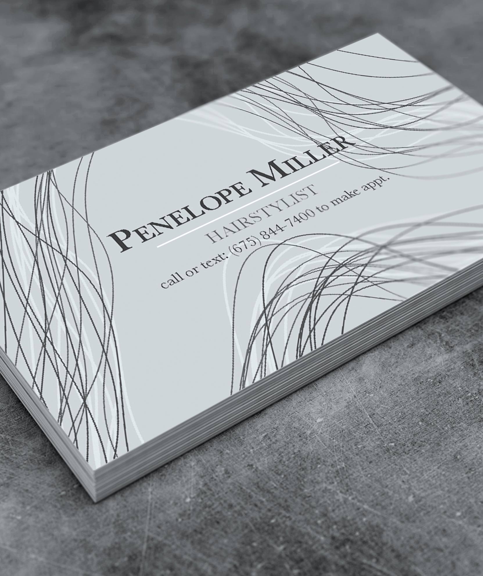
The typeface was created in 1754 by John Baskerville through the development of a new printing process. Known as one of the most legible and elegant typeface of all time, Baskerville typeface is popular in body copy for books and today’s name brands.
John Baskerville, born 1706, was a servant at a clergyman’s when he first got introduced to calligraphy. Although he was illiterate, Baskerville practiced his penmanship and handwriting techniques which later led to his creation of the Baskerville typeface. He started a type foundry in the early 1730s where he sought to perfect the printing process. John Baskerville created a much darker ink that had a "tedious process which resulted in boiling linseed, dissolving rosin, and letting it rest for months before use"2. When printed, the strokes of each letter were crisper and cleaner than printers before him. Remarkably, Baskerville had no former training on printing, he simply followed other printers around, and invested in the same items as they did. He created Baskerville typeface in 1754.
In order to capture the clean lines of the typeface, Baskerville redesigned the printing press. Instead of using a wood platen, he used a brass one which enabled the planes to more evenly. He also used thin tympanum that was heated evenly before each use. His redesigned press along with the intensity of the inks lead to the perfect combination for clean, elegant prints. John Baskerville was inspired by the older typeface, Calson. He wanted to design a perfect and more legible. Although there is not a drastic difference between the two typefaces, Baskerville does have a more refined and finished look to it. Once Baskerville typeface was first printed, many claimed that it was too drastic and was overall not received well.
Although during John Baskerville’s life, the typeface was not very influential after his death in 1775, the Baskerville letter punches found its way to France where it became popular among type foundries. Isaac Moore created its own Baskerville typeface in 1766 at the Bristol’s Fry Foundry. Additionally, Baskerville’s contrasted strokes gave way to the modern typefaces such as Bodoni and Didot. Bruce Rogers, an American typographer, discovered the Baskerville typeface in 1917. He recommended that the Harvard University Press be casted in Baskerville which brought a revival to the typeface in America. In 1996, type designer, Zuzana Licko, created a contemporary Baskerville typeface known as Mrs. Eaves. Licko was inspired by the curving lines and wanted to maintain the welcoming feeling that Baskerville portrays.


